4 Shape Builders
A node’s style.shape holds a function, not a name:
typ.node(0, 0, label: [A], style: (
  shape: typ.shapes.ellipse,
  fill: aqua.lighten(70%),
  stroke: 0.6pt + teal,
  inset: 3pt,
))
There is no string registry to extend and no parallel validation/lookup path — a custom builder is exactly as cheap to select as a built-in one, because selecting either is just naming a function. This is also why a native Typst element like circle can’t be dropped in directly as a shape: the renderer needs the builder to also report fitted geometry for bounds, wire clipping, and ports, which circle itself doesn’t do. Use typ.shapes.circle — the package’s builder, not the element function.
4.1 Built-in builders
shapes-gallery.typ
// Generates docs/img/shapes-gallery.svg — every built-in shape builder.
//   typst compile --root . --ignore-system-fonts docs/img/shapes-gallery.typ docs/img/shapes-gallery.svg
#import "../../src/lib.typ" as typ
#set page(width: auto, height: auto, margin: 8pt)
#set text(size: 7pt)

#let swatch(name, shape) = {
  let node = typ.node(0, 0, label: [A], style: (
    shape: shape,
    fill: rgb("#eef3ff"),
    stroke: 0.6pt + navy,
    min-size: 15pt,
    inset: 3pt,
  ))
  align(center, stack(spacing: 3pt, typ.diagram(scale: 1cm, node), raw(name)))
}

#grid(
  columns: 6, column-gutter: 12pt, row-gutter: 12pt,
  swatch("circle", typ.shapes.circle),
  swatch("ellipse", typ.shapes.ellipse),
  swatch("stadium", typ.shapes.stadium),
  swatch("rect", typ.shapes.rect),
  swatch("square", typ.shapes.square),
  swatch("bare", typ.shapes.bare),
  swatch("triangle", typ.shapes.triangle),
  swatch("flat-triangle", typ.shapes.flat-triangle),
  swatch("trapezoid", typ.shapes.trapezoid),
  swatch("arrow", typ.shapes.arrow),
  swatch("diamond", typ.shapes.diamond),
  swatch("hexagon", typ.shapes.hexagon),
  swatch("regular(5)", typ.shapes.regular(vertices: 5)),
  swatch("regular(8)", typ.shapes.regular(vertices: 8, rotate: 22.5deg)),
  swatch("polygon(..)", typ.shapes.polygon(
    ((-1, -1), (1, -1), (0.35, 0), (1, 1), (-1, 1)),
    anchor: (-0.2, 0),
    clearance: (1.25, 1.1),
  )),
)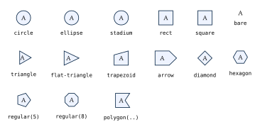
empty (no shape, no label — used as an invisible route point, so it isn’t pictured above) and bare (label only) are the two non-drawing builders. The rest fit an outline around the label plus inset. circle is rotation-invariant; the axis-aligned bare, ellipse, stadium, rect, and square reject a nonzero style.rotate instead of silently ignoring it — reach for a polygon-based builder when rotated geometry is required.
circle contains all four corners of the measured label rectangle, including the label shift from asymmetric padding. It keeps the existing 1.2-axis clearance and minimum-size floor when those already give a larger circle. For example, an unpadded 20pt square label needs a radius of about 14.14pt.
Unlabeled built-in polygons with zero minima and no padding still produce a valid outline: each zero fitting axis receives a 1pt fallback before the template’s own proportions and rotation are applied. Explicit nonzero sizes, even below 1pt, are unchanged. This is a non-degeneracy safeguard, not a recommended visible node size; use shapes.empty for an invisible waypoint. The arbitrary polygon(...) factory likewise keeps a nonzero template when its requested size is zero (normalizing its longer axis to 1pt).
Shape-builder rotation follows Typst’s screen convention, where +90deg is visually clockwise. This is not the same convention as diagram-coordinate angles (edge directions, group()), where +90deg sends +x toward mathematical +y, i.e. visually up — a node whose graphic should track a group(rotate: angle) needs style: (rotate: -angle) on that node; see Fragments and Equations.
4.2 Regular polygons
typ.shapes.regular(vertices: 3, rotate: 0deg, clearance: auto)Returns a builder for any regular polygon of three or more sides. rotate here is baked into the builder once, at factory time — a node’s own style.rotate composes on top of it afterward. With clearance: auto, the builder derives label breathing room from the circumradius/apothem ratio, so a triangle reserves more room around its label than a high-sided polygon does; pass a positive number to override that heuristic.
#let octagon = typ.shapes.regular(vertices: 8, rotate: 22.5deg)
#let stop = typ.node-type("stop", base-style: (
  shape: octagon,
  fill: red, stroke: 0.8pt + maroon,
  min-size: 18pt, inset: 3pt,
))
A regular heptagon, or any other n-gon, needs no new package code — the factory computes its unit points and trigonometry once, rather than repeating that work per node.
4.3 Arbitrary fitted polygons
typ.shapes.polygon(vertices, anchor: auto, rotate: 0deg, clearance: 1, label-offset: (0, 0))Returns a builder from three or more unitless numeric point pairs. The template is scaled uniformly until its bounding box meets the fitted width and height, preserving aspect ratio.
anchor: autouses the template’s bounding-box centre as the node origin. Pass an explicit point when that centre would land outside a concave silhouette — the node origin must be strictly inside the polygon, because wire clipping casts a ray from it and needs a well-defined first exit.rotate:rotates the template before fitting; a node’s ownstyle.rotaterotates the already-fitted result, applied afterstyle.flipmirrors it.clearance:is a positive number, or an(x, y)pair, multiplying label breathing room.label-offset:is a numeric template-space vector that scales and rotates with the polygon.
#let chevron-shape = typ.shapes.polygon(
  ((-1, -1), (0.2, -1), (1, 0), (0.2, 1), (-1, 1), (-0.35, 0)),
  anchor: (-0.1, 0),
  clearance: (1.25, 1.1),
)
Concave polygons are supported; self-intersecting ones are not, and fitting does not prove that a padded label rectangle stays inside every concave silhouette — inspect the result visually and adjust clearance:.
4.4 Directional shapes and flip
triangle, flat-triangle, trapezoid, and arrow are directional: each honors style.flip, mirrored across the shape’s local y-axis before style.rotate is applied. This is the same mirror-then-rotate order used everywhere a builder in the package composes the two, so a new directional builder can’t accidentally apply them in the other order.
flip earns a place as its own concept — not just another style key — because mirroring and rotating answer different questions. Rotating an arrow by 180° and mirroring it can even look identical for a shape with no other asymmetry, but they mean different things once a label, a slant, or a tip ratio is involved: mult(..., flip: true) says “this is the same arrow, pointing the other way,” while a rotation says “this is the same arrow, at a different angle.” state/effect make the distinction concrete — they are the same flat-triangle shape, related by a mirror, not by a rotation:
flip-vs-rotate.typ
// Generates docs/img/flip-vs-rotate.svg — directional shapes and flip:.
//   typst compile --root . --ignore-system-fonts docs/img/flip-vs-rotate.typ docs/img/flip-vs-rotate.svg
#import "../../src/lib.typ" as typ
#let diagram = typ.diagram
#set page(width: auto, height: auto, margin: 8pt)
#set text(size: 8pt)

// A mirrored pair declared directly with flip: true in base-style (the
// "effect is state mirrored" pattern), and a flippable: true constructor a
// document can flip per call.
#let tri = typ.node-type("tri", base-style: (shape: typ.shapes.flat-triangle, fill: white, stroke: 0.6pt + black, min-width: 26pt, min-height: 20pt))
#let tri-mirror = typ.node-type("tri-mirror", base-style: (shape: typ.shapes.flat-triangle, flip: true, fill: white, stroke: 0.6pt + black, min-width: 26pt, min-height: 20pt))
#let pointer = typ.node-type("pointer", flippable: true, base-style: (shape: typ.shapes.arrow, fill: luma(220), stroke: 0.6pt + black, min-size: 11pt, inset: 3pt))

#table(
  columns: 4, align: center + horizon, stroke: none, column-gutter: 16pt, row-gutter: 4pt,
  [*`tri`*], [*`tri-mirror`*], [*`pointer`*], [*`pointer(flip: true)`*],
  diagram(scale: 1cm, { tri(0, 0) }),
  diagram(scale: 1cm, { tri-mirror(0, 0) }),
  diagram(scale: 1cm, { pointer(0, 0, label: $m$) }),
  diagram(scale: 1cm, { pointer(0, 0, label: $m$, flip: true) }),
  [flat-triangle,\ default orientation], [same shape,\ `flip: true` in `base-style`], [arrow points\ right], [mirrored,\ not rotated],
)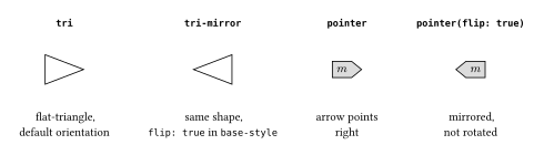
effect gets there by setting flip: true in its node-type base-style (see Theming); mult and map instead declare flippable: true so documents can flip them per call with a top-level flip: argument, on top of whatever the theme already set. Reach for flippable: true on any reusable kind whose shape is directional — see node-type().
4.5 Composite parts and marks
One node can paint extra silhouettes without inventing a new shape builder. Put an array or dictionary of part specifications in the node style’s "shape.parts" key:
typ.node(0, 0, style: (
  shape: typ.shapes.circle,
  min-size: 12pt,
  fill: white,
  "shape.parts": (
    (shape: typ.shapes.circle, inset: 3pt, fill: none, stroke: 0.6pt + black),
  ),
  mark: "cross",
  mark-size: 100%,
  mark-stroke: 0.55pt + black,
))
A part can be a builder function, or a style dictionary with an optional shape. layer: "behind" paints it before the base body and label; layer: "front" is the default. transform: accepts an absolute (dx, dy) length pair or an (x: .., y: ..) dictionary. The older parts key remains an alias, but shape.parts is the canonical spelling.
Parts follow the same zoom rules as their parent. Absolute min-size, inset, radius, stroke thickness, and transform offsets scale with diagram(scale:) and group(scale:); a percentage radius remains a percentage of the scaled part. Part-local min-size wins over inherited per-axis minima.
Parts affect visual bounds but do not change wire attachment: clipping and gate ports use the base outline only. They receive a zero-sized label box, so the node label is drawn once on the base. Their transform coordinates are node-local screen lengths (+y down), not diagram coordinates. See the reference for inheritance and replacement behavior.
mark: "cross" and mark: "measurement" are conveniences implemented as parts. Mark size, thickness, fill, and stroke are independently configurable. A percentage cross size is relative to the resolved base silhouette, so a 100% target keeps fitting even below 5pt; the automatic 6pt fallback is used only when there is no larger reference size. Absolute marker geometry and stroke weights scale with the diagram. See Composite shape styling for the complete key contract.
4.6 Custom shape builders
A builder’s conceptual signature is:
(measured-label, resolved-inset, resolved-style) => outlinemeasured-labelhas absolutewidth/height.resolved-insethas absoluteleft/right/top/bottom.resolved-styleholds every merged style value. Core geometric fields (min-width,inset,radius,stroke, …) are already scaled to absolute units; unknown custom fields pass through unchanged, since the renderer can’t infer their units or meaning. Prefer dimensionless custom ratios, or derive lengths fromfit-box/the resolved core dimensions, so custom geometry still follows diagram andgroup()zoom.
Two helpers cover most custom geometry:
typ.fit-box(label, pad, style, clear-x: 1, clear-y: 1, square: false)returns a fitted(width, height)pair.typ.polygon-outline(points, label-offset: (0pt, 0pt))validates absolute-length point pairs and returns a complete polygon outline.
#let kite-shape = (label, pad, style) => {
  let (width, height) = typ.fit-box(label, pad, style, clear-x: 1.4, clear-y: 1.3)
  let (hw, hh) = (width / 2, height / 2)
  typ.polygon-outline(
    ((0pt, -hh), (hw, 0pt), (0pt, hh), (-hw * 0.65, 0pt)),
    label-offset: (-hw * 0.08, 0pt),
  )
}

#let kite = typ.node-type("kite", base-style: (
  shape: kite-shape, fill: white, stroke: 0.6pt + black, inset: 3pt,
))
A builder must return one of these outline kinds:
(kind: "empty")
(kind: "bare")
(kind: "circle", radius: <non-negative length>)
(kind: "ellipse", half-width: <length>, half-height: <length>)
(kind: "rect", half-width: <length>, half-height: <length>, radius: <length>)
(kind: "polygon", points: <absolute point array>, label-offset: <absolute pair>)
Circle, ellipse, and rectangle outlines may include an optional absolute label-offset; polygons require it. empty/bare reject one entirely. The renderer adds the standard per-side inset displacement afterward and unions the shifted label with the silhouette for diagram bounds, so an intentional offset is never cropped.
Any geometry reducible to those six kinds — closed circle, ellipse, rectangle, or polygon silhouettes, plus the two non-drawing kinds — is expressible with a custom builder. A genuinely new primitive, such as an open path or a shape with a hole, needs a new core outline kind plus matching drawing, bounds, and clipping logic; see Extending typograph.
typ.shapes.build-outline(builder, measured-label, resolved-inset, style) is the low-level validator the renderer itself calls at this boundary. Most theme authors never call it directly, but it’s the fastest way to test a custom builder in isolation, without rendering a whole diagram:
#context {
  let outline = typ.shapes.build-outline(
    kite-shape, measure[A],
    (left: 3pt, right: 3pt, top: 3pt, bottom: 3pt),
    typ.node-defaults,
  )
}(measure needs a known layout context, hence the context wrapper — the renderer itself always calls build-outline from inside one.)
Full outline-kind field contracts and every built-in builder’s exact behavior are in the Shape Reference.